Clinical tone
The products spoke like institutions when users needed something warm and approachable.
A witty, Gen-Z mental-health companion for tracking emotions and habits — but with personality.
Read the case study ↓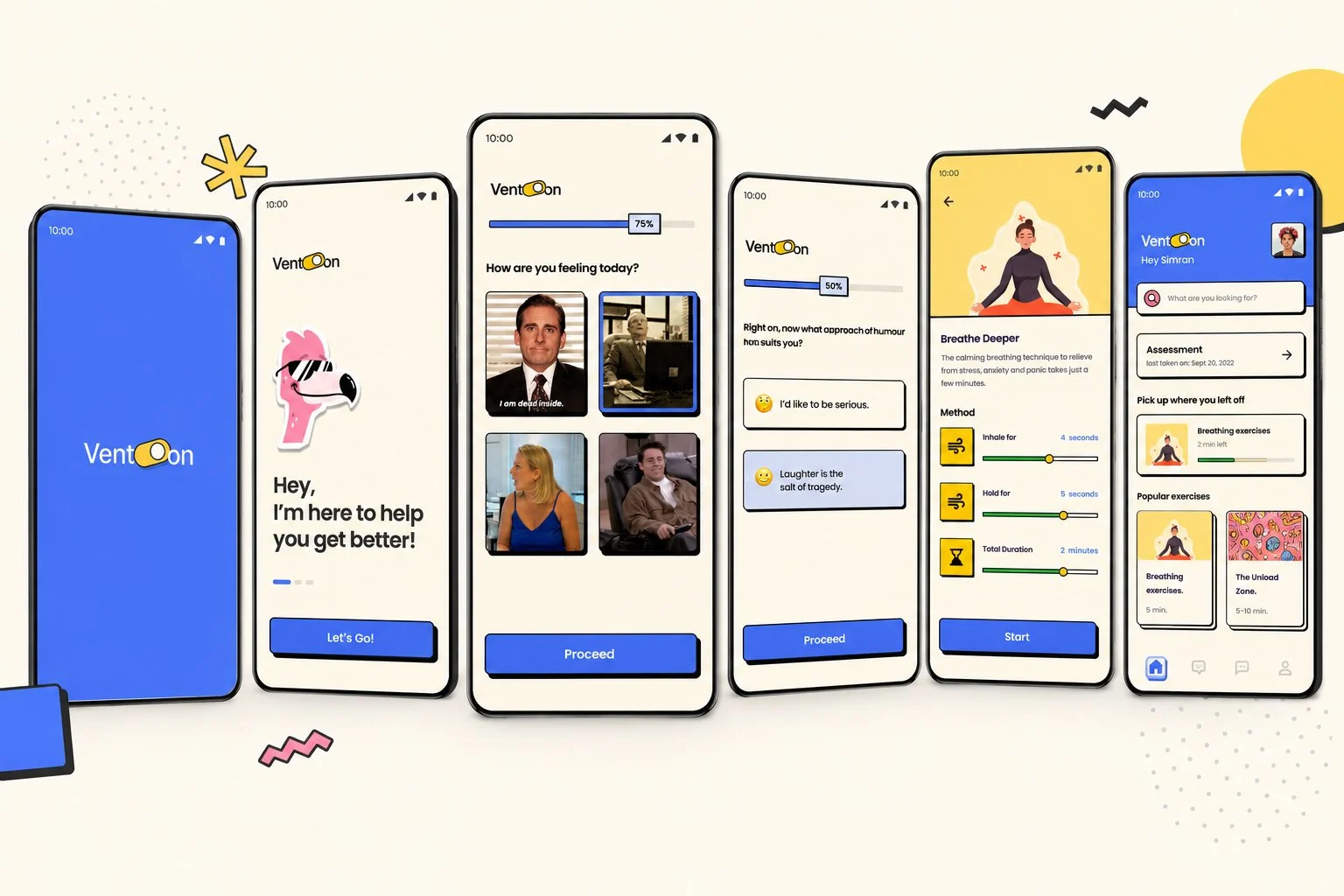
THE BRIEF
Vent-On is a Gen-Z mental-health companion designed to help users track emotions, recognise patterns, and build habits. But the core idea wasn't the features — it was the tone.
I was the first and only designer, owning product design, user flow, design system, brand language, and hi-fi prototyping end to end.
The question behind the project: can a mental-health app have a personality without trivialising mental health?
THE PROBLEM
Clean, minimal, well-structured — yet the experience felt sterile. The tone was clinical, interfaces were rigid, and interactions resembled filling out a report more than having a conversation.
The products spoke like institutions when users needed something warm and approachable.
Logging emotions felt like completing a form rather than checking in with yourself.
People still needed support, but the experience gave them little reason to come back.
RESEARCH
I ran a survey and six interviews about people's relationship with mental-health apps. The responses weren't surprising — but they were telling.

“A lot of times I feel lonely but the apps don't help.”
“The tone of these apps is so depressing!”
“Are we sure the copywriters are not depressed?”
AFFINITY MAPPING
After surveys and interviews, I translated recurring concerns into “How Might We” questions. They naturally grouped around two emotional territories.
ISOLATION
ALLEVIATING
SORTING IDEAS & PRIORITISING
Every interview surfaced a feature someone wanted. I clustered the ideas into four themes, then ran them through MoSCoW — with one rule fixed in advance: personality is a Must-have, never a nice-to-have.
Mood, emotions, and habits captured without feeling like homework.
Patterns framed as a gentle check-in rather than a report.
Light, relatable moments that make someone want to return.
The voice and tone running through all of it — the non-negotiable.
Personality & tone system
Daily mood check-in
Emotion & habit tracking
Reflection loop
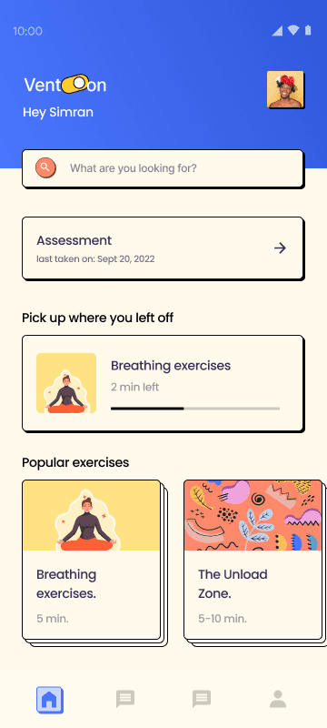
Activity / module library
Habit streaks
Unload zone
Journaling
Grounding exercises
Mini-games
“Call a friend” nudge
Anonymous stranger chat
Full resource directory
Social feed
Three core flows done with care beat fifteen done without. MoSCoW kept personality from being diluted by feature creep.
THE CONCEPT
A Gen-Z-friendly companion that helps users track emotions and habits — but with character. Not comedic, not trivial. Just approachable. The features other apps have too; the tone is what makes someone stay.
Warm, expressive, and human where other apps feel sterile and institutional.
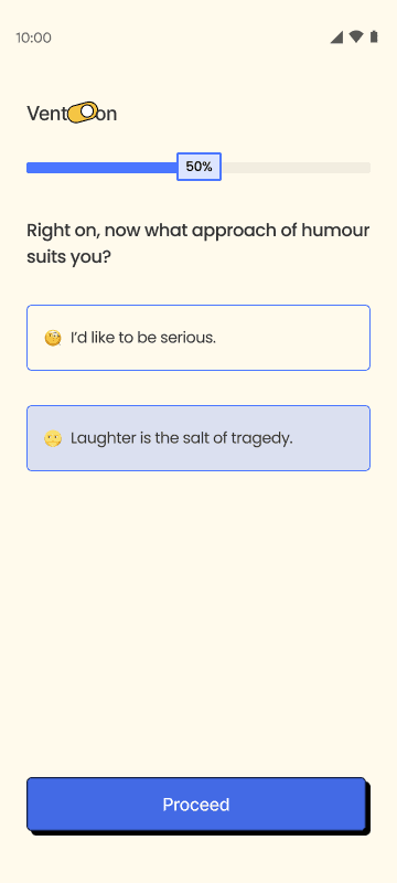
It talks with you rather than at you — closer to a check-in than a form.
No streaks to defend or scores to chase. Low-stakes and judgment-free.
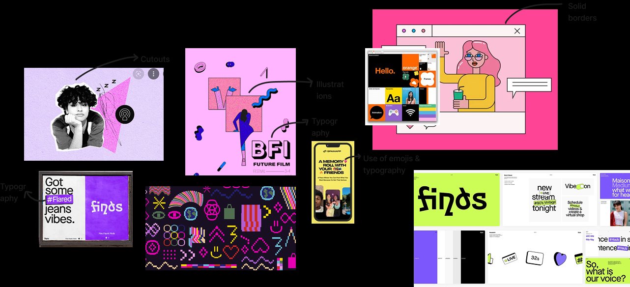
MOODBOARDING
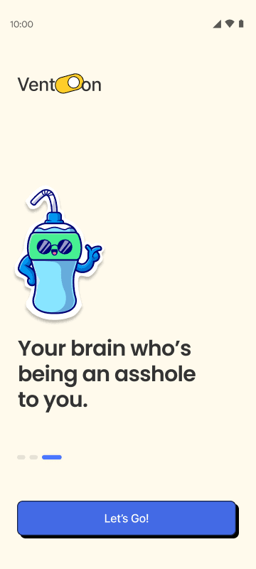
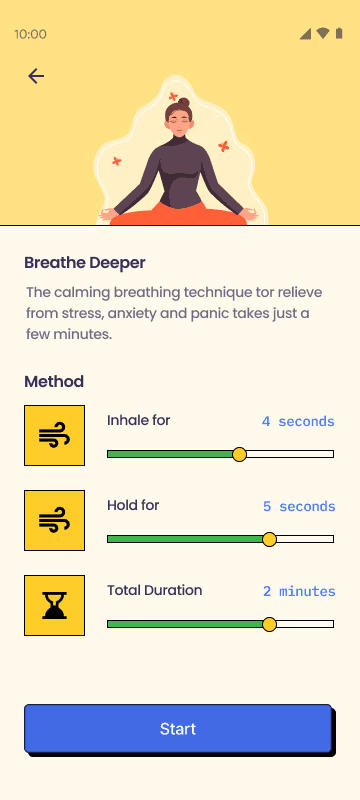
Since the app targets people who typically avoid self-help apps for being too corny, I built it in the style of Gen Z — reassuring, modern, and gentle. Neobrutalism brought solid borders, cutouts, bold type, and expressive illustrations.
DESIGN SYSTEM
Built before a single screen — a friendly sans-serif, a palette far from clinical blues and greys, and a neobrutalist component language that feels like a friend, not a form.
A warm cream base instead of clinical white. Purple carries trust; yellow and coral carry the personality.
Feeling okay?
Let's check in.
Aa Bb Cc — the quick check-in.
No right answers. No judgment. Just tap whatever's closest.

USER FLOW
Onboarding happens once. After that, the daily check-in and reflection form a loop the user returns to — designed to become a habit, not a chore.
ONBOARDING
DAILY CHECK-IN
REFLECTION
Flows 2 and 3 repeat daily — reflection feeds straight back into the next check-in.
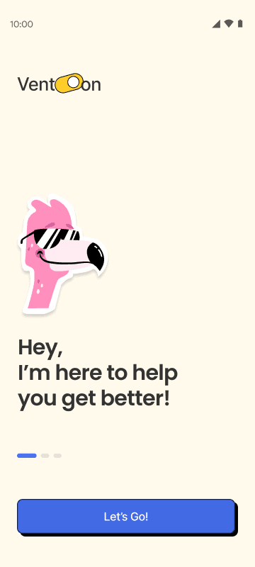
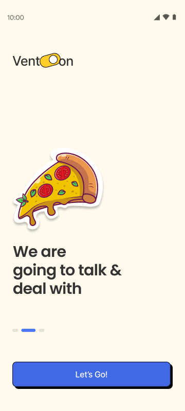
HI-FIDELITY SCREENS

DESIGN DECISIONS
INSTEAD OF
Clean grids, muted tones, and serious typography — the visual language used by every major mental-health app.
I CHOSE
Bold borders, warm cream backgrounds, and expressive illustrations. A system that feels like a friend, not a therapist's office.
INSTEAD OF
Emotion tracking as a task — streaks, scores, and progress metrics.
I CHOSE
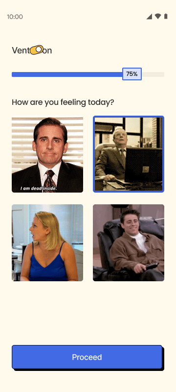
Low-stakes conversation. Meme-worthy image options. No right answers and no judgment.
INSTEAD OF
Packing in every wellness feature before deciding what the product should feel like.
I CHOSE
MoSCoW made tone a must-have. Three core flows done with care beat fifteen flows done with none.
REFLECTION
I used to think voice and personality were the last 5% of a product. Vent-On taught me they're the first decision. Everything else follows.
Moodboarding before wireframing changed how I approach consumer products. Getting the feeling right before the layout saved weeks of rework.
Choosing a visual language because it communicates something — not because it's in style — is the difference between a designed system and a styled one.
Back to the portfolio
See more work →