THE NEWLY WORRIED
Where do I start?
Women and girls who suspect they may have PCOS and don't know what to do next.
A dedicated app that turns scattered PCOS information, infrequent doctor visits, and hard-to-sustain routines into one place that educates, guides, and assists.
Read the case study ↓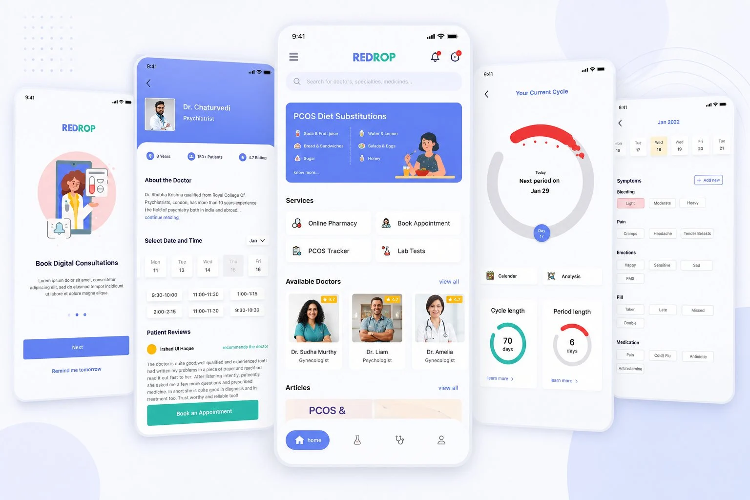
THE PROBLEM
Polycystic Ovary Syndrome is one of the most common hormonal disorders among women of reproductive age — bringing irregular cycles, excess androgen, acne, weight fluctuations, and long-term health risks.
Despite how common it is, managing it feels fragmented. Information is scattered. Doctor visits are infrequent. Lifestyle changes are hard to sustain. Most women navigate it alone.

new PCOS cases recorded in India
every single year
DESIGN PROCESS
Redrop followed a User-Centered Design approach — an iterative process keeping real needs central at every stage. Before building a single feature, I needed to know exactly who this was for.
The scope widened beyond tracking — the product had to educate, guide, and assist, not just monitor.
THE NEWLY WORRIED
Women and girls who suspect they may have PCOS and don't know what to do next.
THE DIAGNOSED
Those already managing PCOS day to day, juggling treatment and lifestyle.
THE SUPPORTERS
Partners, friends, and family helping someone with PCOS through it.
QUALITATIVE RESEARCH
I ran six in-depth interviews to understand lived experiences with PCOS — chasing depth over volume. The conversations surfaced three patterns again and again: inconsistent follow-ups, confusion around treatment, and difficulty sustaining lifestyle change.
WHAT I ASKED
“I get told what to do, but never why — so the moment it gets hard, I just stop.”Recurring sentiment across interviews
QUANTITATIVE RESEARCH
To check whether the interview patterns held more broadly, I ran a Google Forms survey. Twenty-five people responded on demographics, trust in digital health, and behaviour.
AGE OF RESPONDENTS
OPEN TO ONLINE APPOINTMENTS?
TRUST AN APP WITH MEDICAL DATA?
Users are willing to go digital — but trust has to be designed intentionally, not assumed.
USER PERSONA

PRIMARY PERSONA
20 · she/her · Delhi, India
“I want to feel in control of my body — not lectured by it.”
FROM INSIGHTS TO IDEAS
Each insight pointed to something the product could do. I translated them into concrete directions to design against.
USER FLOW
The flow mapped how someone moves through the app — keeping medical support and lifestyle tracking together instead of making the user stitch fragmented tools into a routine.
List of doctors → about the doctor → slot booking → confirmation
Categories → medicines → filters → cart
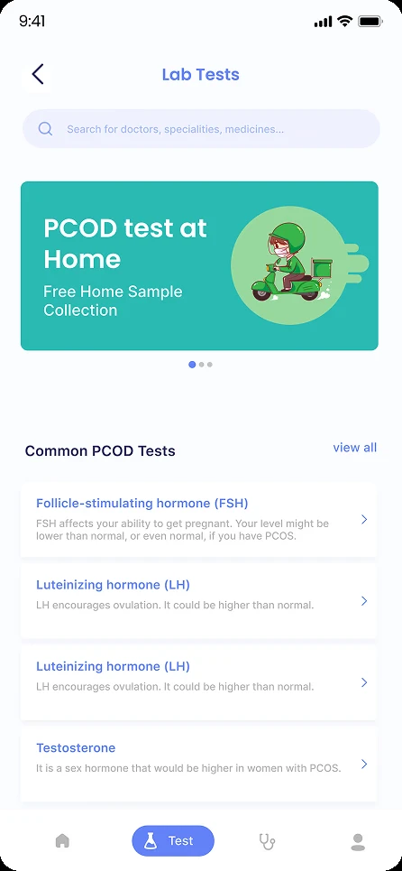
Categories → common tests → home sample collection
Tracker → analytics → profile
WIREFRAMES
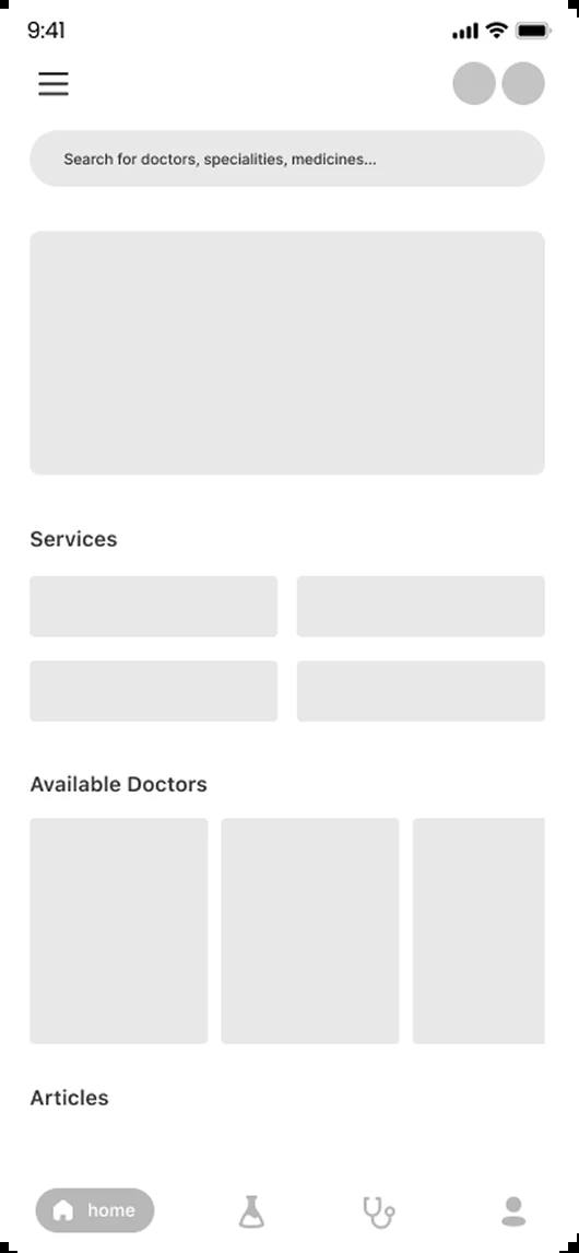
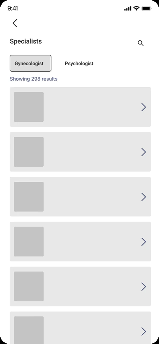
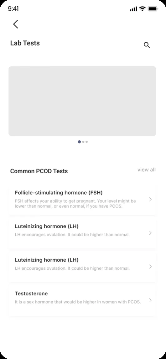
With the structure and flow in place, I moved from lo-fi sketches to mid-fi wireframes — something concrete enough to test the navigation and core flows with users before committing to visual design.
PROTOTYPE & USABILITY CHECKS
The clickable mid-fi flow made the core journeys tangible early, so navigation and task clarity could be checked before the visual layer was added.
HI-FIDELITY
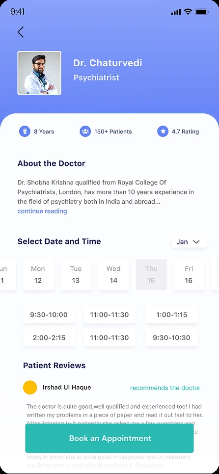
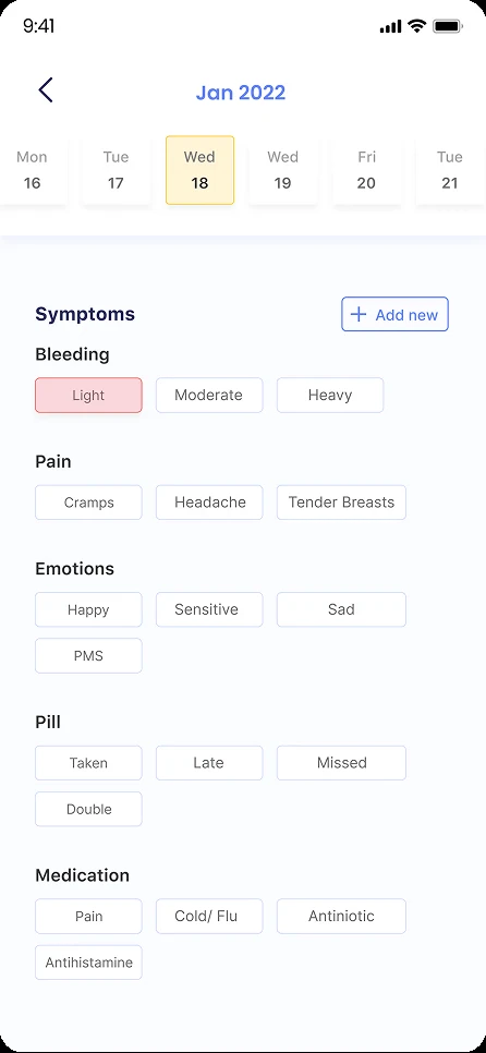
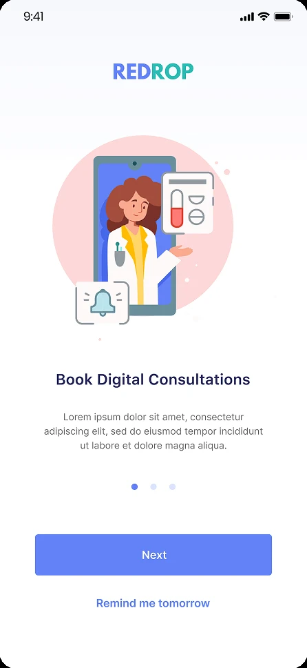
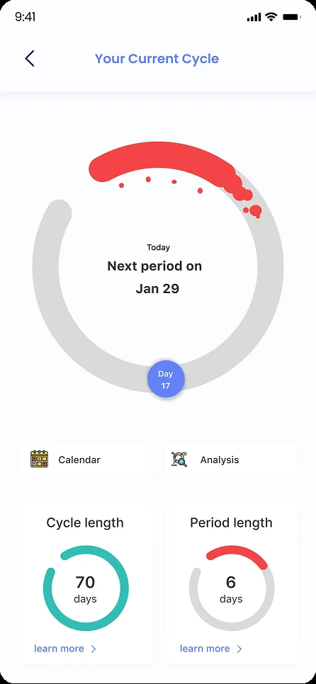
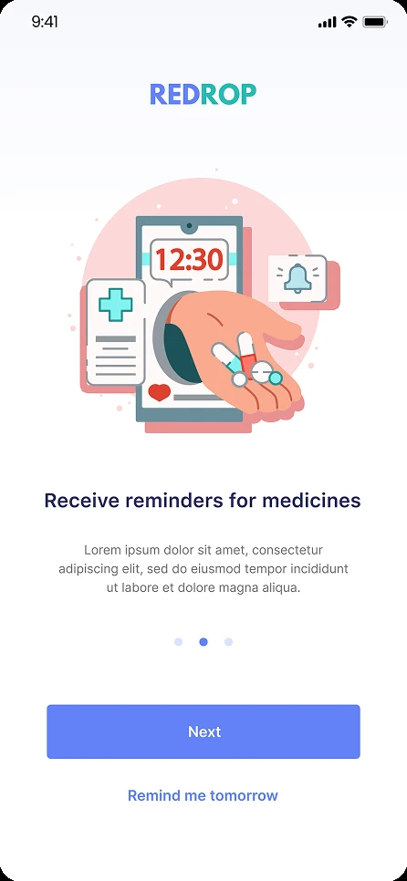
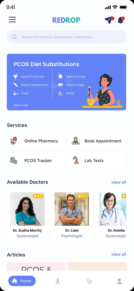
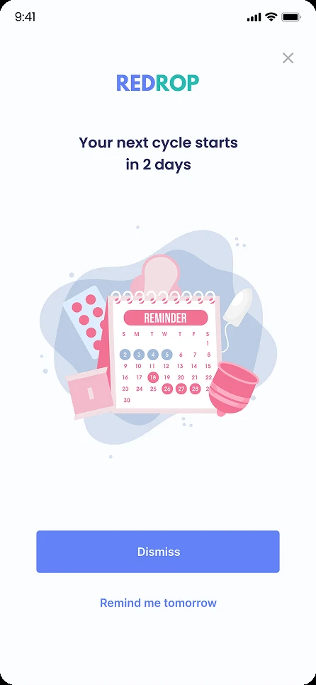
The final screens brought the system together — onboarding, a cycle tracker, symptom logging, doctor discovery, and appointment booking — in one warm, approachable interface designed to make a clinical topic feel manageable, not medical.
REFLECTION
Half of surveyed users were hesitant to trust an app with medical data. That wasn't a reason to drop features — it was a brief to design transparency, control, and reassurance into every sensitive flow.
Designing for carers and the newly-suspecting — not just the diagnosed — reframed Redrop from a tracker into an ecosystem that educates and guides.
Six honest interviews surfaced more usable insight than the survey alone could. The qualitative depth is what made the persona and flows feel real.
OUTCOME
distinct user groups served in one ecosystem
research-backed feature directions defined
of flows grounded in qualitative and quantitative research
Back to the portfolio
See more work →